Achieving harmony in a contemporary home is not about compromise; it’s about designing an integrated system where aesthetics and function are two sides of the same coin.
- Effective design reduces cognitive load by prioritizing clarity and purpose over ornamentation, creating a calming environment.
- True functionality is engineered through an understanding of building science, from strategic window placement to optimized circulation paths.
Recommendation: Treat your home’s design as a performance system. Analyze every choice—from wall placement to window specifications—for its impact on both your daily activities and overall well-being.
The dream of a contemporary home often conjures images of sleek, open spaces and minimalist beauty. Yet, for many urban families, the reality can be a frustrating disconnect between a house that looks stunning and one that truly works. We’re told to use multi-functional furniture or paint walls white, but these are merely surface-level fixes. They don’t address the core tension: how do you create a home that is both an aesthetic statement and a highly efficient machine for living, especially within a footprint of around 2000 square feet?
The common approach often pits style against usability, forcing a compromise. But what if the secret to perfect balance isn’t a compromise at all? The most successful contemporary designs don’t just look good; they are rooted in a deeper understanding of human psychology, structural possibilities, and building science. This is where we move beyond decoration and into the realm of architectural strategy. It’s about thinking of your home as a system designed to support and enhance your life, not just contain it.
This guide reframes the conversation. Instead of offering simple tips, we will explore the core principles that architects use to fuse beauty and function. We will dissect how to manage cognitive load, engineer flawless traffic flow, make critical structural decisions, and leverage light and building science to create a space that is not only visually striking but profoundly livable. It’s time to stop choosing between a beautiful home and a functional one, and start designing one that is intelligently both.
This article provides a structured approach to mastering the balance between form and function in your home. Each section delves into a specific architectural challenge, offering expert insights and actionable solutions to transform your living space.
Summary: Mastering the Art and Science of Contemporary Home Design
- Why Excessive Ornamentation Increases Cognitive Load in Small Homes?
- How to Design a Traffic Flow That Eliminates Bottlenecks in the Hallway?
- Custom Build vs Prefabricated Modules: Which Suits Contemporary Design Better?
- The Load-Bearing Wall Error That Ruins Open Concept Dreams
- How to Position Windows to Reduce Artificial Lighting Needs by 40%?
- How to Layer Ambient, Task, and Accent Lighting in a Windowless Room?
- Why a Low U-Factor Matters More Than R-Value for Windows?
- How to Design Smart Layouts for Small Urban Apartments Under 600 Sq Ft?
Why Excessive Ornamentation Increases Cognitive Load in Small Homes?
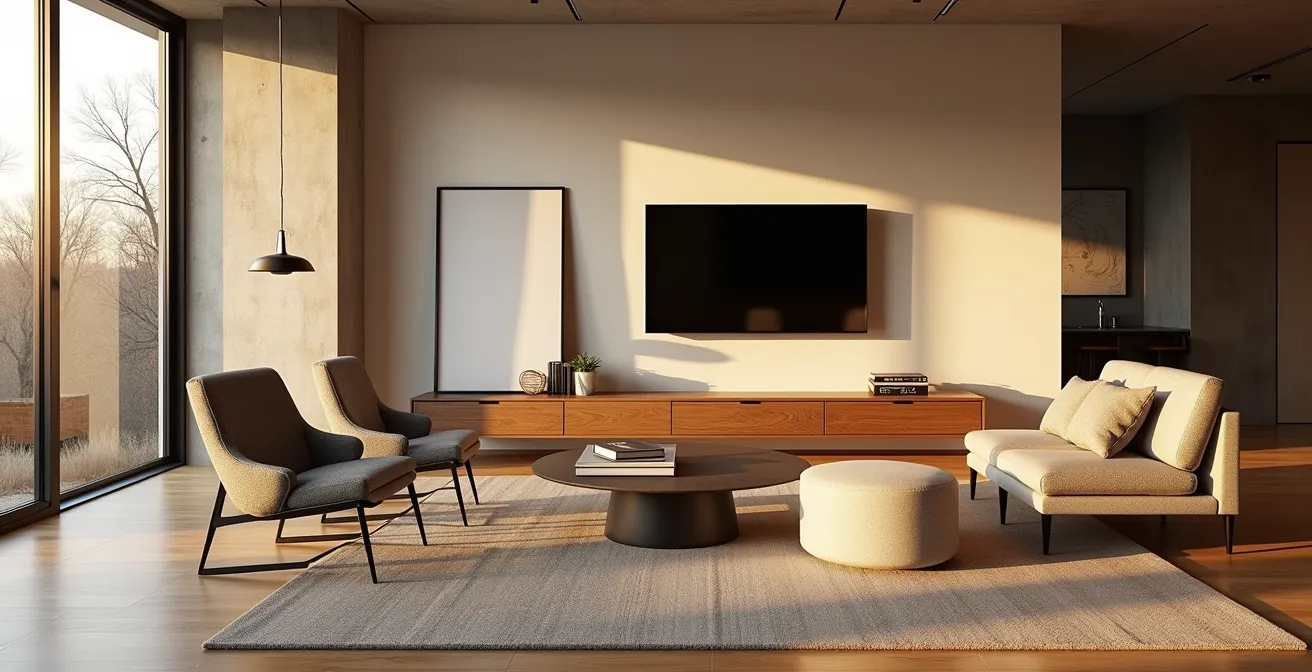
In contemporary architecture, the principle of “less is more” is not just an aesthetic preference; it’s a strategy grounded in cognitive science. Every object, pattern, and decorative element in a room demands a small amount of mental processing power. In a compact 2000 sq ft home, an accumulation of non-functional ornamentation can create a state of low-level visual noise. This “visual clutter” constantly vies for our attention, leading to an increased cognitive load—the total amount of mental effort being used in your working memory. The result is a space that feels subtly stressful and mentally draining, rather than restorative.
The brain must work to filter out irrelevant information to focus on tasks. Excessive decor, complex patterns, or a multitude of purely ornamental objects force this filtering process into overdrive. This is more than just a feeling of being disorganized. In fact, research into architectural psychology confirms that visual stressors like pattern glare and visual clutter are prominent causes of migraines and can disproportionately affect neurodiverse individuals. A minimalist approach, therefore, is a functional choice to create a serene environment. By stripping away the unnecessary, you allow the essential elements—light, space, and key functional pieces—to define the room, reducing mental fatigue and promoting a sense of calm.
This principle was validated in a study on adaptive design, where environments simplified to reduce cognitive strain led to a 25% decrease in cognitive fatigue during navigation tasks. The lesson for residential design is clear: a well-designed contemporary home functions as a quiet background for life, not a loud collection of things. True luxury is not the abundance of possessions, but the freedom and mental clarity that a well-edited space provides.
How to Design a Traffic Flow That Eliminates Bottlenecks in the Hallway?
The functionality of a home can be measured by how effortlessly you can move through it. Architects refer to these movement paths as circulation paths, and they are the arteries of your home. A poorly designed flow creates daily friction: a corner you always bump into, a doorway blocked when a cabinet is open, or a hallway that becomes a traffic jam. In a 2000 sq ft home where space is optimized, engineering these paths to be intuitive and obstruction-free is paramount. The goal is to eliminate bottlenecks before they are ever built.
The process starts with identifying primary and secondary paths. Primary paths are the main routes—from the entrance to the kitchen, from the living room to the bedrooms. These should be wide, straight, and clear. A key architectural standard is to maintain a minimum clearance of 36-42 inches for these main thoroughfares. This allows for comfortable passage for one person and easy movement of items. For areas where two people might pass each other, such as the main stretch of a kitchen or a major hallway, aiming for a 60-inch clearance is ideal, which also accommodates wheelchair accessibility.
Secondary paths, like the space between a bed and a dresser, have different requirements. Here, the focus is on functional access rather than thoroughfare. Consider these standards:
- Leave about 14–20 inches between the side of the bed and a wall or dresser.
- Ensure only 2–8 inches separate the bed from a nightstand to maintain easy reach.
- Crucially, always test the “action radius” of furniture. You must have ample clearance to fully open closet doors, dresser drawers, and appliance doors without creating a blockage.
By mapping these paths and respecting these clearances during the design phase, you create an invisible architecture of movement that makes a home feel fluid, spacious, and fundamentally functional.
Custom Build vs Prefabricated Modules: Which Suits Contemporary Design Better?
When embarking on a contemporary home project, one of the foundational decisions is the construction method. The choice between a traditional custom build and modern prefabricated modules is not just about budget and timeline; it fundamentally influences the design’s outcome and the balance of aesthetics and function. As the ALMA de LUCE Design Team notes, this balance is critical:
This balance allows spaces to be pleasing to the eye while also efficiently supporting users’ daily activities. A design that prioritizes style over functionality can be visually impressive but frustrating to live in. Conversely, a highly functional space that lacks style can feel cold and impersonal.
– ALMA de LUCE Design Team, Balancing Style and Functionality in Interior Design
A custom build offers the ultimate design flexibility. It allows the architecture to respond perfectly to the unique characteristics of the site, such as views, sun orientation, and topography. This method is ideal for creating one-of-a-kind spaces with artisanal finishes and complex geometries. However, this bespoke approach typically involves higher costs, longer build times, and a quality that is highly dependent on the skill of individual contractors. It excels in aesthetic precision but requires rigorous oversight to ensure functional execution.
On the other hand, prefabricated modules offer unparalleled efficiency and quality control. Built in a factory setting, these components are manufactured to tight tolerances, minimizing material waste and ensuring a consistent level of quality. This method drastically reduces on-site construction time and can offer significant cost savings. The trade-off is in design flexibility; while customization is possible, it operates within the constraints of the manufacturer’s system. Prefabrication champions function and predictability, delivering a high-performance building envelope with machine-like precision.
This comparative table breaks down the key differences, sourced from an in-depth analysis of style and functionality.
| Aspect | Custom Build | Prefabricated Modules |
|---|---|---|
| Design Flexibility | Maximum customization for site-specific needs | Limited to manufacturer specifications |
| Cost Efficiency | Higher initial investment | Lower upfront costs, reduced labor expenses |
| Build Time | 6-12 months typical | 2-4 months typical |
| Quality Control | Variable, depends on contractors | Consistent factory standards |
| Aesthetic Precision | Artisanal finishes possible | Machine-like precision, minimal tolerances |
The Load-Bearing Wall Error That Ruins Open Concept Dreams
The open-concept floor plan is the hallmark of contemporary living, promising light-filled, interconnected spaces. However, the dream can quickly turn into a structural nightmare if load-bearing walls are not handled with architectural expertise. The most common error is underestimating or incorrectly identifying which walls are supporting the weight of the house. Removing a load-bearing wall without providing adequate alternative support can lead to catastrophic sagging floors, cracked drywall, and even structural failure. Simply replacing a wall with a beam of the same depth is often not enough.
Before any demolition, a systems audit is non-negotiable. This involves not only identifying the structural supports but also tracing the plumbing, HVAC, and electrical lines that are often hidden within those walls. Rerouting these systems can be complex and expensive, sometimes making the removal of a specific wall functionally impractical. True open-concept design isn’t about removing walls; it’s about creating wide, uninterrupted structural spans from the outset. Strategic use of engineered beams can create a ‘free plan’, allowing interior walls to be non-structural and easily reconfigured in the future.
When removing an existing load-bearing wall, there are several sophisticated alternatives to a simple, bulky beam. Each offers a different balance of strength and aesthetic. Mastering these solutions is key to achieving a seamless, open look that feels intentional, not retrofitted.
Action Plan: Key Alternatives to Load-Bearing Walls
- LVL (Laminated Veneer Lumber) Beams: Assess if an LVL beam can be recessed into the ceiling joists. This creates a completely flat, uninterrupted ceiling plane for a truly seamless appearance.
- Exposed Steel I-Beams: Consider if a steel I-beam can be left exposed. Plan its finish (painted or raw) to act as a deliberate industrial or modern aesthetic element, turning structure into sculpture.
- Flitch Beams: Evaluate if a flitch beam—a steel plate “sandwiched” by wood—is suitable. Its high strength-to-size ratio allows for a smaller profile than an equivalent wood beam, minimizing its visual impact.
- Systems Audit: Before finalizing the beam choice, map all plumbing, HVAC, and electrical systems within the target wall. Create a detailed plan for rerouting to avoid unforeseen costs and complications.
- Future-Proofing: For new builds, specify engineered beams to create large clear spans from the start. This allows for a “free plan” where interior walls are non-load-bearing, ensuring maximum future adaptability.
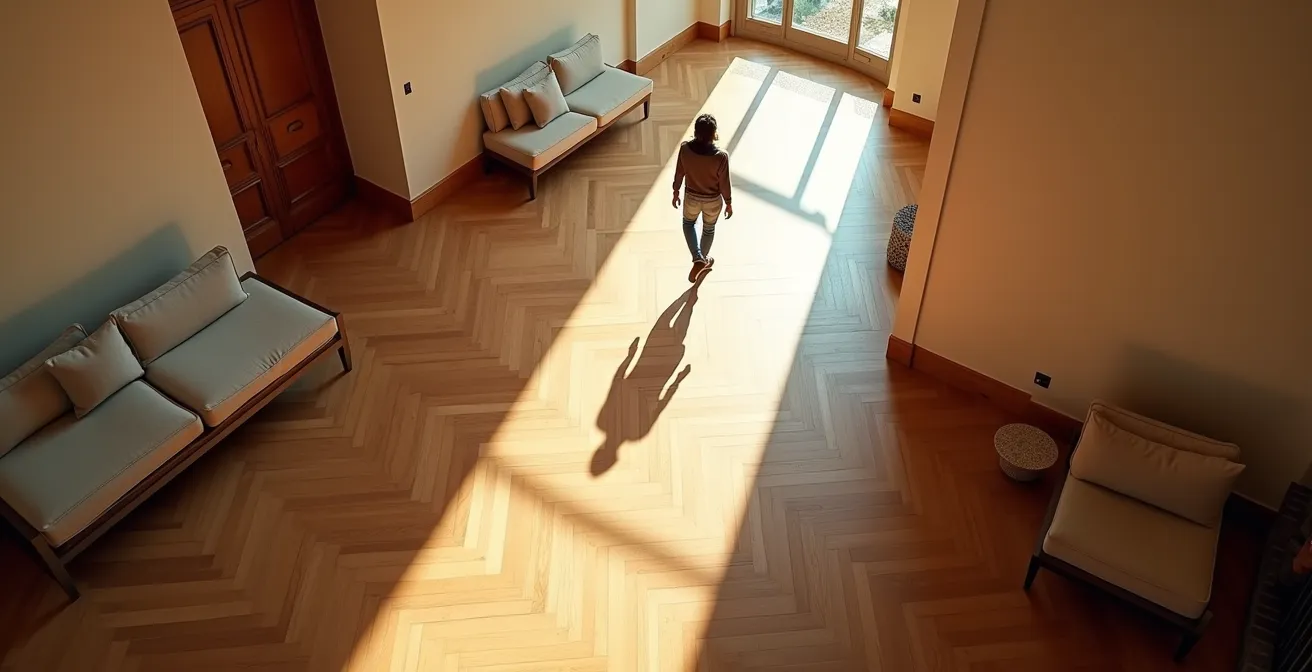
How to Position Windows to Reduce Artificial Lighting Needs by 40%?
In contemporary architecture, windows are far more than just openings for views; they are a critical component of the home’s energy and lighting system. Strategic window placement, known as daylighting, is the practice of using natural light to illuminate the interior as much as possible, thereby reducing the need for artificial lighting. An effective daylighting strategy can cut electricity usage for lighting by 40% or more, but its benefits extend far beyond energy savings. Natural light is proven to make spaces feel larger, enhance mood, and boost energy levels, directly contributing to the well-being of the inhabitants.
Achieving this requires a site-specific analysis. The goal is to maximize useful daylight while controlling for its negative side effects: glare and unwanted solar heat gain. This involves orienting the home and its windows thoughtfully:
- South-facing windows are ideal in the Northern Hemisphere. They receive consistent, manageable sunlight throughout the day. When paired with correctly calculated roof overhangs, they can provide passive solar heating in the winter (when the sun is low) and be shaded from the high summer sun.
- North-facing windows provide excellent, diffuse, and glare-free light, making them perfect for workspaces or art studios. However, they offer little to no passive heating.
- East and West-facing windows should be used cautiously. They can cause intense glare and significant heat gain during the morning and afternoon, respectively. Vertical fins or deep-set windows can help mitigate these effects.

Advanced daylighting techniques can further optimize light distribution. Light shelves are horizontal surfaces placed inside or outside a window that bounce sunlight up onto the ceiling, casting it deep into a room. Clerestory windows, which are short, wide windows set high up on a wall, provide balanced, diffuse light without compromising privacy. For illuminating core interior spaces like hallways or bathrooms, solar tubes are highly efficient, capturing sunlight on the roof and channeling it down through a reflective tube. By combining these strategies, a home can be designed to feel bright and open all day long, powered by the sun.
How to Layer Ambient, Task, and Accent Lighting in a Windowless Room?
Creating a functional and inviting atmosphere in a room without windows—be it a basement, a home office, or an interior bathroom—is one of the most telling tests of a good lighting plan. The key is to replicate the complexity and dynamism of natural light through a deliberate layered lighting strategy. This involves combining three distinct types of artificial light, each with a specific job, to create a space that is flexible, comfortable, and visually interesting. A single overhead fixture will only result in a flat, uninviting environment with harsh shadows.
The three essential layers are:
- Ambient Lighting: This is the general, foundational layer of light that fills the room and allows for safe navigation. In a windowless room, this can be achieved with recessed downlights, a central flush-mount fixture, or by washing a wall with light to create a sense of openness.
- Task Lighting: This is focused, brighter light directed at specific areas where activities occur. Think under-cabinet lighting in a kitchenette, a desk lamp in an office, or vanity lights flanking a bathroom mirror. Task lighting prevents eye strain and makes the space highly functional.
- Accent Lighting: This is the “sculpting” layer. It creates visual interest by highlighting architectural features, artwork, or textured surfaces. Techniques like wall grazing (aiming light at a shallow angle on a textured wall like brick or stone) or pinpointing a spotlight on a plant can add depth, drama, and a focal point to the room.
Beyond layering, technology offers powerful tools for mimicking nature. Tunable-white smart lighting allows you to adjust the color temperature of your lights throughout the day, following a natural circadian rhythm. This means you can have a cool, energizing, high-Kelvin light (like daylight) during working hours, and shift to a warm, relaxing, low-Kelvin light (like sunset) in the evening. For accurate color perception in a space devoid of natural light, it is critical to select bulbs with a Color Rendering Index (CRI) of 90 or higher. This ensures that colors of textiles, finishes, and even skin tones appear true and vibrant, not washed out or distorted.
Key takeaways
- Function and aesthetics are not opposing forces but integrated outcomes of a systems-based design approach.
- Understanding building science, from structural spans to window performance (U-factor), is more critical than surface-level decoration.
- Effective space planning reduces cognitive load and improves daily life by engineering flow and eliminating friction.
Why a Low U-Factor Matters More Than R-Value for Windows?
When selecting windows for a contemporary home, the discussion often revolves around R-value. However, from a building science perspective, the U-factor is the more critical metric for overall performance. While R-value measures a material’s resistance to heat flow (higher is better), it often refers only to the center of the glass. The U-factor, conversely, measures the rate at which an entire window assembly—including the glass, frame, and spacers—transmits heat (lower is better). It provides a holistic view of the window’s performance in preventing heat loss in winter and heat gain in summer.
The distinction is crucial because the frame and edges of the glass are typically the weakest points in a window’s thermal barrier. A window with a high center-of-glass R-value can still perform poorly if it has a thermally inefficient aluminum frame. The U-factor captures this total performance, making it the primary metric used by programs like ENERGY STAR for certification. According to National Fenestration Rating Council standards, high-performance double-pane windows can achieve a U-factor of 0.30 or lower, while some triple-pane windows can reach as low as 0.15.
The table below, based on data from the U.S. Department of Energy, clarifies the roles of these two key metrics.
| Metric | U-Factor | R-Value |
|---|---|---|
| What it measures | Rate at which a window transmits non-solar heat flow | Resistance to heat flow |
| Rating scope | Entire window performance, including frame and spacer | Often center-of-glass only |
| Better performance | Lower values (0.15-0.30) | Higher values (3.3-6.7) |
| ENERGY STAR basis | Primary certification metric | Secondary reference |
The real-world impact is significant. A case study of an Energy Star ZERH (Zero Energy Ready Home) build demonstrated that upgrading from triple-pane windows with a U-factor of 0.30 (R-3.3) to ones with a U-factor of 0.20 (R-5) improved the windows’ insulation value by 51%. This translates directly to lower energy bills and a more comfortable, quiet interior. Prioritizing a low U-factor is a technical decision that yields a direct functional and financial benefit, embodying the core of smart contemporary design.
How to Design Smart Layouts for Small Urban Apartments Under 600 Sq Ft?
While this article focuses on a 2000 sq ft home, the most innovative spatial strategies often emerge from the most constrained environments. The world of micro-apartments (under 600 sq ft) is a laboratory for hyper-efficient design, and its principles can be brilliantly applied to maximize specific zones within a larger home. Whether creating a highly functional home office, a compact mudroom, or a multi-purpose guest area, thinking like a micro-living architect ensures that not a single square inch is wasted.
One core concept is the 80/20 Use-Case Rule: design your permanent layout for the 80% of activities you do daily, and use flexible solutions for the 20% of activities that happen less frequently. For example, instead of a large, dedicated guest room that sits empty most of the year, design a beautiful home office or library with a high-quality, integrated Murphy bed or a stylish sleeper sofa. This prioritizes daily function without sacrificing occasional needs. Another key strategy is the use of “soft” divisions of space. Instead of building permanent walls, use furniture like a bookshelf, a decorative screen, or even the back of a sofa to delineate “rooms” within an open area, creating zones without sacrificing light and openness.
Case Study: The KW Apartment by Anthill Studio
A prime example of these principles in action is the KW Apartment, a luxury redesign of a 600 sq ft space. As an analysis of the project shows, the architects fit a full suite of rooms including a separate dining room and an office. Their success hinged on multi-functionality and hidden storage. The bedroom features a bed that is part of a larger storage unit and can be folded against the wall. Sliding doors are used extensively to make the space feel larger, and a minimal color palette of light birch and white, punctuated by color bursts and ample natural light, creates a sense of spaciousness. This project proves that luxury and function are a matter of intelligent design, not square footage.
Applying these lessons to a 2000 sq ft home means being more critical about dedicated, single-use spaces. Utilize vertical space with floor-to-ceiling storage to keep floor plans clear. Choose multi-functional furniture like storage ottomans and extendable tables. And use visual tricks like continuous flooring across multiple rooms and large mirrors opposite windows to create an illusion of greater depth and connectivity. By adopting this mindset, you can make a spacious home feel even more generous and intelligently designed.
Start today by evaluating your own home not just for how it looks, but for how it performs. Identify areas of friction, analyze the quality of light, and question whether every element serves a purpose. By applying these architectural principles, you can begin the journey of transforming your house into a home that is a true testament to contemporary design: beautiful, functional, and deeply supportive of your life.