The secret to a home with personality isn’t accumulating more items; it’s applying a deliberate curation framework to create a cohesive narrative.
- Following fleeting trends often results in a space that feels impersonal and dated within a few years.
- A balanced room is achieved not by chance, but by using strategic principles like the 80/20 rule for color, style, and texture.
Recommendation: Shift your mindset from “decorating” to “curating” by defining a personal aesthetic filter before making any new purchases.
You have good taste. You’ve invested in quality furniture, chosen a sophisticated color palette, and maybe even splurged on a piece of art you love. Yet, when you look around your living space, something feels off. It’s pleasant, it’s modern, but it lacks a distinct soul. It could be a page from a catalog rather than a reflection of you. This is a common frustration for homeowners aged 30-45 who find their homes are stylish but strangely sterile, lacking the character that makes a house a home.
The conventional advice often falls short. You’re told to “buy what you love” or “display personal photos,” but this can easily lead to a cluttered, disjointed environment. The problem isn’t a lack of personal items; it’s the absence of a unifying story. True curation is an art of intentional selection and strategic placement, where every object, from the sofa to a small vintage bowl, contributes to a greater whole.
But what if the key to unlocking your home’s personality wasn’t about adding more, but about being more selective? What if a simple framework could guide your choices, ensuring harmony and character coexist? This guide moves beyond generic tips to provide a professional stylist’s approach. We will deconstruct the art of curation, focusing on a powerful principle: the 80/20 rule. You’ll learn how to diagnose why your current space feels flat, select pieces that tell a story, master the balance between vintage and modern, and even refresh your look on a tight budget—all without hiring an expert.
This article provides a comprehensive roadmap to transform your space. Explore the sections below to master each step of the curation process and build a home that is an authentic extension of who you are.
Summary: A Stylist’s Guide to Personalized Home Curation
- Why Blindly Following Trends Creates a Soulless Home Environment?
- How to Select Decor Pieces That Tell a Story Without Cluttering the Room?
- Vintage Finds vs Modern Staples: Which Should Dominate Your Curated Space?
- The Curation Mistake That Makes Expensive Furniture Look Cheap
- How to Refresh Your Curated Look on a $500 Budget?
- Why a Large Pattern Makes a Small Room Feel Claustrophobic?
- Why Hanging Lights Too High Kills the Intimacy of a Dinner Party?
- How to Master Curated Decor Without Hiring a Professional Stylist?
Why Blindly Following Trends Creates a Soulless Home Environment?
A home that feels soulless is often a home built on trends rather than timeless principles. Trends, by their nature, are fleeting. That bouclé sofa or checkerboard rug that dominates social media today will inevitably be replaced by the next big thing in a year or two. When your decor is a collection of these fashionable moments, it lacks a personal narrative and a sense of permanence. It reflects the market, not your story. The result is a space that feels generic and can quickly look dated, because it was never truly yours to begin with.
The antidote to this is shifting your focus from trends to archetypes. Archetypes are classic forms, materials, and proportions that have remained relevant for decades. Think of a well-crafted leather armchair, a simple linen curtain, or a solid wood table. These pieces possess an inherent quality that transcends fleeting styles. They serve as the stable foundation of your home, while trends can be sprinkled in as temporary, low-investment accents if you wish.
Distinguishing between a fleeting trend and a lasting archetype is the first skill of a home curator. Here’s how to tell them apart:
- Assess longevity: Archetypes remain relevant for 10+ years, while trends often fade within 2-3 years.
- Check material quality: Timeless pieces typically use natural materials like wood, stone, and metal that age gracefully, whereas trends often rely on synthetics.
- Evaluate proportion: Classic archetypes tend to follow balanced, harmonious proportions, while trends often feature exaggerated or unusual shapes for shock value.
- Test versatility: An archetypal piece can work in multiple rooms and settings, but a trendy item is often highly context-specific.
How to Select Decor Pieces That Tell a Story Without Cluttering the Room?
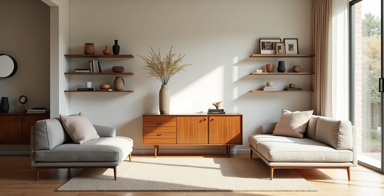
Once you have a solid foundation of archetypal furniture, the next layer is adding personality. This is where many people go wrong, mistaking “personality” for “clutter.” The key is not to simply display your possessions, but to practice narrative grouping. This involves arranging a few carefully chosen items together to create a small, contained story—a vignette. Instead of ten souvenirs scattered around a room, select three that share a common theme, color, or origin and group them on a console table or a floating shelf.
This technique creates focal points that draw the eye and invite curiosity, rather than overwhelming the senses. A successful vignette feels intentional and cohesive. The goal is to hint at a story, not spell it out. This curated approach respects the “negative space” in your room, allowing both your decor and your space to breathe. The case study below shows how a clear rule can help achieve this balance.
Case Study: Applying the 80/20 Color Rule for a Playful, Cohesive Playroom
As detailed in an Apartment Therapy feature, interior stylist Cori transformed her daughters’ playroom using a strict 80/20 color rule. She designated a warm pink as the dominant 80% of the palette, using it on the walls and larger elements. To prevent it from becoming overwhelming, she introduced the remaining 20% as cool-toned blue accents through a William Morris play mat and carefully selected artwork. This framework allowed her to incorporate unique vintage finds, like a refurbished dollhouse and a customized toy trunk, without the space feeling chaotic. The rule provided the structure, while the curated pieces provided the story.
The image below illustrates this principle of narrative grouping, where texture, form, and suggestion combine to create a compelling, uncluttered story.
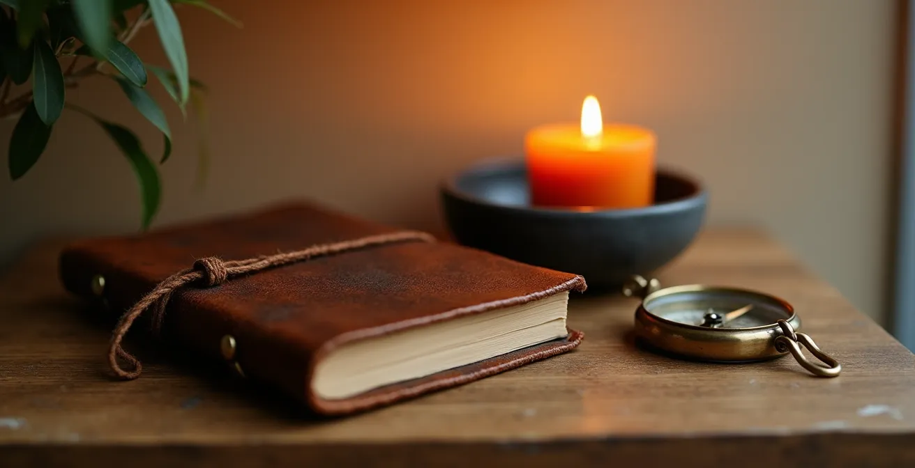
As you can see, the objects work together. The weathered texture of the journal, the matte finish of the candle vessel, and the aged patina of the brass compass create a unified mood. Each piece has room to be appreciated, yet they form a single, powerful statement. This is the essence of selecting decor that tells a story without creating noise.
Vintage Finds vs Modern Staples: Which Should Dominate Your Curated Space?
One of the most effective ways to inject personality into a modern space is by mixing in vintage or antique pieces. This blend creates a dynamic tension between the old and the new, giving a room depth and a sense of history. However, getting the balance right is crucial. Too much vintage can make a room feel like a dusty museum; too little, and the space remains sterile. So, which should dominate?
The answer lies, once again, in the 80/20 rule. For a space that feels contemporary yet soulful, modern staples should form the functional and structural backbone of your room, while vintage finds act as the character-rich accents. According to professional designers, the ideal balance is maintaining an 80/20 ratio between modern and vintage pieces. This means about 80% of your room’s key elements—like your sofa, main storage, and foundational lighting—should be modern for their reliability and clean lines. The remaining 20% is your space for personality: a unique art deco mirror, a mid-century side chair, or a rustic farmhouse dining table.
This framework ensures your space remains functional and cohesive while allowing for moments of surprise and individuality. The modern pieces provide the rhythm and structure, while the vintage elements provide the soul. The following table breaks down their respective contributions to a curated space.
| Element | Vintage Contribution | Modern Contribution |
|---|---|---|
| Visual Impact | Soul & Character | Rhythm & Structure |
| Materials | Patina & History | Clean Lines & Consistency |
| Functionality | Conversation Starters | Daily Practicality |
| Investment | Unique Statement Pieces | Foundation & Framework |
| Maintenance | Requires Special Care | Easy Upkeep |
By using your 20% budget for vintage on one or two significant “statement” pieces, you create powerful focal points that elevate the entire room. This strategy is far more effective than scattering numerous small, insignificant old items throughout the space.
The Curation Mistake That Makes Expensive Furniture Look Cheap
Have you ever seen an expensive, beautifully designed sofa look completely lost and insignificant in a room? The single biggest curation mistake is not the piece of furniture itself, but the failure to give it a proper context. A high-end item can look cheap if its “supporting cast” of surrounding elements undermines its quality. This includes the space around it, the accessories near it, and its relationship to the room’s architecture.
Think of your statement furniture like a lead actor on a stage. If the stage is too crowded, the lighting is poor, or the supporting actors are weak, the star’s performance will be diminished. The same is true for your decor. You must actively curate the environment around your best pieces to let them shine. Ignoring this context is what devalues your investment and makes a room feel unresolved and chaotic.
Here are four critical curation mistakes that can make high-end furniture look cheap:
- Ignoring negative space: An expensive piece needs “breathing room” to be appreciated. Crowding it with other items or pushing it tight against a wall diminishes its presence. As a rule, try to maintain at least 18-24 inches of space around major furniture.
- A weak supporting cast: Placing a cheap, mass-produced lamp or a flimsy side table next to a high-quality armchair creates a visual disconnect that cheapens the entire vignette. Accessories should match the caliber of the main piece.
- Wrong rug scale: A rug that is too small for the furniture grouping makes the whole setup feel cramped and poorly planned. A properly scaled rug should extend 6-8 inches beyond the furniture on all sides, anchoring the setting.
- Fighting the architecture: Placing furniture against the natural flow of traffic or ignoring architectural focal points like a fireplace or a large window creates a sense of unease and makes the layout feel accidental.
While rules like 80/20 provide an excellent starting point, they are not rigid formulas. As the Hestya Design Team notes, it’s about creating a feeling of balance.
The 80-20 rule is not a strict formula, but rather a flexible guideline that you can adapt to your own taste and preference.
– Hestya Design Team, Key Elements of 80-20 Rule in Interior Design
This flexibility allows you to use the rule as a tool to enhance your expensive pieces, ensuring they are the heroes of your space, not victims of poor context.
How to Refresh Your Curated Look on a $500 Budget?
Creating a curated home is an evolution, not a one-time project. As your tastes evolve, you’ll want to refresh your space. The good news is that you don’t need a massive budget to make a significant impact. By applying the 80/20 principle strategically, a budget as small as $500 can completely transform the feel of a room. The secret is to focus your investment on one or two high-impact “jewelry” pieces rather than trying to change everything.
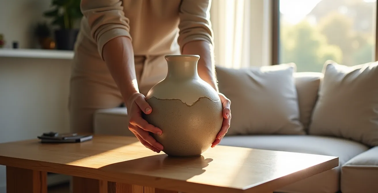
Keep 80% of your existing furniture and decor, especially the foundational, archetypal pieces. Then, allocate your entire $500 budget to the 20% that will provide the most visual bang for your buck. This could be a single, sculptural floor lamp, a bold piece of oversized art, a set of luxurious velvet curtains, or a unique, handcrafted vase. This single new element acts as a catalyst, making you see all your existing pieces in a new light. It can tie together a color scheme, add a missing texture, or create a much-needed focal point.
The power of this approach lies in its precision. Instead of making several small, forgettable changes, you make one memorable one. This is far more effective and sophisticated. The following case study demonstrates how even a budget under $200 can create a dramatic refresh when spent wisely.
Case Study: The Under-$200 Facebook Marketplace Refresh
A creative homeowner demonstrated the power of a strategic refresh on a minimal budget. After finding a plain white toy trunk on Facebook Marketplace, she transformed it using leftover paint samples to create a custom piece. By keeping 80% of the room’s existing furniture, she was able to allocate the majority of her small budget to just one new item: a statement light fixture. This single purchase tied the new trunk and the existing decor together, creating a cohesive playroom that felt entirely new for a total investment of under $200. It proves that the impact of a purchase is about its strategic role, not its price tag.
Why a Large Pattern Makes a Small Room Feel Claustrophobic?
It’s a common design rule: avoid large patterns in small rooms. The conventional wisdom is that big, bold prints will overwhelm the space and make it feel smaller and more claustrophobic. However, this is a simplification. The real issue isn’t the size of the pattern, but its visual weight and repeat density. A pattern’s visual weight is determined by its color contrast, line thickness, and the amount of negative space within the design.
A pattern can have a large scale (the individual elements are big) but a low visual weight (e.g., a soft gray damask on a white background). Conversely, a small-scale pattern can have a very high visual weight if it’s busy and high-contrast (e.g., a black-and-white houndstooth). As experts point out, the latter can feel far more claustrophobic.
It’s not about pattern size, but Visual Weight and Repeat Density. A large-scale but low-contrast, airy pattern can feel more spacious than a small-scale, high-contrast, busy pattern.
– Douglas Cutler Architects, The 80-20 Rule in Decorating
The true cause of that claustrophobic feeling is a lack of a “resting point” for the eye. A dense, high-contrast pattern that covers every surface creates a relentless visual noise. To counteract this, you need to provide visual relief. You can do this by breaking up a patterned wall with a large mirror, a piece of solid-colored art, or tall, solid furniture. In fact, in very small, enclosed spaces like a powder room, a large, bold pattern can be used intentionally to create a “Jewel Box Effect”—a deliberate, immersive, and luxurious experience that embraces the small size rather than fighting it.
Why Hanging Lights Too High Kills the Intimacy of a Dinner Party?
Lighting is one of the most powerful yet misunderstood tools in home curation. You can have the perfect table, chairs, and dinnerware, but if the lighting is wrong, the atmosphere will fall flat. A common mistake is hanging a pendant light or chandelier too high above a dining table. This creates a vast, brightly lit area that feels more like a cafeteria than an intimate gathering space. The light spills everywhere, conversations feel exposed, and the psychological boundary of the “social space” is destroyed.
To create intimacy, you need to create a defined “pool” of light that is centered on the table. This is achieved by lowering the light fixture. This simple adjustment establishes a lower, psychological ceiling that encourages people to lean in and connect. It isolates the dining area from the rest of the room, fostering a sense of togetherness. For optimal intimacy, interior designers recommend hanging dining lights between 30-36 inches above the table surface. This height illuminates the table beautifully without casting harsh shadows on guests’ faces or obstructing sightlines.
The goal is to recreate what designers call the “Campfire Effect”—a primal human instinct to gather around a source of light and warmth. This effect is not just about height, but also about the quality of the light.
Case Study: The Campfire Effect in Modern Dining Design
A Scandinavian-inspired condo in Manila successfully fostered dining intimacy by leveraging this principle. Designers lowered a series of pendant lights to create a distinct light pool over the dining table. They specifically used warm-toned bulbs at a lower wattage, which eliminated harsh overhead glare. The surrounding space was kept slightly dimmer, which psychologically separated the social zone from the open-plan living area. This simple lighting strategy recreated the primal “campfire” gathering effect that humans are evolutionarily wired to seek, encouraging connection and prolonged conversation.
This approach transforms a simple meal into a shared experience, proving that how you light a space is just as important as what’s in it.
Key takeaways
- True personality in a home comes from a deliberate curation framework, not an accidental collection of personal items.
- The 80/20 rule is a versatile and powerful guideline for balancing modern staples with vintage finds, dominant colors with accents, and foundational pieces with decorative “jewelry.”
- Context is king: the perceived value of any piece is determined by the negative space, scale, lighting, and supporting elements around it.
How to Master Curated Decor Without Hiring a Professional Stylist?
Mastering the art of home curation may seem like a skill reserved for professional stylists, but it is entirely achievable on your own. The key is to trade impulsive decisions for a methodical process. Professionals don’t rely on magic; they rely on a framework. By adopting their techniques, you can develop your own “eye” for design and build a space that evolves thoughtfully and organically over time, reflecting your unique story.
The most important tool in this process is creating your “Aesthetic Filter.” This is a simple, written document that acts as your personal North Star for every decor decision. Before you even think about buying a new item, you filter it through these predefined criteria. This prevents costly mistakes and ensures every piece you bring into your home contributes to your cohesive vision. It transforms you from a passive consumer into an active curator of your own life.
This structured approach demystifies the design process and empowers you to make confident choices. By comparing your DIY methods with professional ones, you can see how simple tools and techniques can bridge the gap.
| Aspect | DIY Approach | Professional Method | DIY Alternative |
|---|---|---|---|
| Space Planning | Trial and error | CAD software | Free online room planners |
| Color Selection | Paint samples | Color theory training | 80/20 rule application |
| Sourcing | Retail shopping | Trade resources | Vintage markets + online |
| Timeline | Rushed decisions | Phased approach | Quarterly acquisition plan |
| Budget | Impulse buying | Detailed allocation | One statement piece focus |
To put this all into practice, you can follow a four-step method that mimics a professional workflow, adapted for a DIY designer.
Your Action Plan: The 4-Step Professional Curation Method
- Create a Digital Prototype: Before buying anything, use a free tool like Canva or a room planner to create a mood board. Place images of your existing furniture alongside potential new pieces to test visual harmony.
- Develop Your Aesthetic Filter: On one page, define your core style. This should include: 3 core value words (e.g., “warm,” “minimal,” “natural”), a 5-color palette, 3 preferred materials (e.g., oak, linen, brass), and a “Never Buy” list (e.g., “no plastic,” “no fake-distressed wood”).
- Master the Vignette Rule of Three: Practice curation on a small scale. Take a bookshelf or coffee table and create groupings of three objects, varying their height, texture, and shape until the balance feels right.
- Implement a Curation Calendar: Resist the urge to decorate all at once. Commit to acquiring only one significant new piece per quarter. This forces thoughtful decisions and allows your home to evolve organically with you.
Your journey to a curated home begins not with a shopping trip, but with a moment of reflection. Start today by developing your Aesthetic Filter. This single step will provide more clarity and direction than any trend, and it will be the foundation for a home that is, finally and completely, a reflection of you.
Frequently Asked Questions about Curated Home Decor
Can large patterns ever work in small rooms?
Yes, through the ‘Jewel Box Effect’ – in very small, enclosed spaces like powder rooms, a large bold pattern can create a deliberate, immersive experience rather than feeling claustrophobic.
What creates the claustrophobic feeling with patterns?
A pattern without a ‘resting point’ for the eye is the true cause. Break up patterned walls with mirrors, solid blocks of color, or tall furniture to provide visual relief.
How do I choose the right pattern scale?
Consider visual weight over size – low-contrast patterns in similar tones feel more spacious than high-contrast busy patterns, regardless of scale.