The secret to a functional small apartment isn’t finding smaller furniture; it’s applying urban planning principles of flow and zoning to guide movement and perception.
- Effective layouts prioritize clear circulation paths, making a space feel intuitive and larger than its measurements suggest.
- Strategic furniture choices and placement create distinct “micro-zones” for living, sleeping, and working without physical walls.
Recommendation: Start by mapping the primary “traffic routes” in your apartment, from the door to the window, to the kitchen. This is the foundation of your entire layout.
Living in a space under 600 square feet presents a unique design challenge. The default impulse is often to shrink everything: smaller sofas, smaller tables, smaller ambitions for the space. Common advice reinforces this, focusing on visual tricks like light paint colors and mirrors to create an illusion of space. While helpful, these are merely surface-level tactics. They address the symptoms of a cramped apartment but fail to solve the core problem: an inefficient and unintuitive floor plan that works against you every single day.
But what if the solution wasn’t about making things look bigger, but feel better? What if the key to unlocking your small apartment’s potential lay not in decoration, but in the fundamental principles of spatial psychology and movement? The true breakthrough comes when you stop thinking of your apartment as a box to be filled and start seeing it as a small-scale urban environment. It requires a strategic approach to circulation flow, micro-zoning, and managing cognitive load, creating a home that is not just organized, but truly livable and expansive in feeling.
This guide will walk you through this strategic approach. We will deconstruct the common mistakes that make small spaces feel chaotic and claustrophobic. From there, we will explore expert techniques for defining zones, choosing furniture with purpose, and exploiting every dimension of your apartment to build a layout that is both intelligent and deeply comfortable.
Summary: How to Design Smart Layouts for Small Urban Apartments Under 600 Sq Ft?
- Why Your Furniture Placement Makes Your Studio Feel 20% Smaller?
- How to Separate Sleeping and Living Areas Without Blocking Light?
- Full-Size vs Apartment-Size Furniture: Which Is Better for Resale Value?
- The ‘Push Against the Wall’ Mistake That Kills Intimacy in Small Rooms
- How to Exploit Vertical Space to Double Your Storage Capacity?
- Why Excessive Ornamentation Increases Cognitive Load in Small Homes?
- How to Turn the Gap Under Your Bed into a Dust-Free Wardrobe?
- Zoning Strategies: How to Define Spaces in an Open Plan Without Building Walls?
Why Your Furniture Placement Makes Your Studio Feel 20% Smaller?
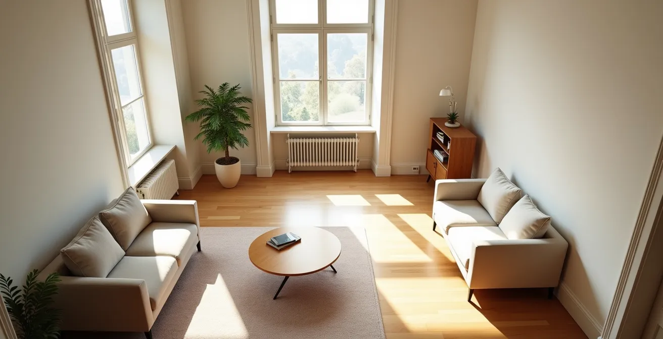
The single biggest factor shrinking your small apartment isn’t the size of your furniture, but the way it obstructs movement. When pathways are unclear, narrow, or convoluted, your brain registers the space as smaller and more stressful. This is a core principle of spatial psychology: a space is only as large as it is easy to navigate. Effective layouts are built around clear circulation flows, the invisible pathways people naturally take to move through a room. According to design guidelines, you need at least 30-48 inches for major traffic routes and a minimum of 24 inches for minor paths to avoid a feeling of congestion. Ignoring this creates friction and makes even a thoughtfully decorated room feel cramped.
Think of your apartment’s floor plan like a city grid. The most effective layouts often incorporate circular paths that allow for continuous movement, a concept validated by architectural studies. An analysis of floor plans found that circular paths create continuous flow movement, which enhances spatial perception and makes a dwelling feel larger. Instead of creating dead ends, furniture should be arranged to guide you around a central point or along a looped route. This could mean pulling a sofa away from the wall to create a path behind it or using a round coffee table to ease movement around a seating area. The goal is to design a layout that your body can navigate on autopilot, freeing up cognitive resources and creating a sense of effortless flow.
Action Plan: Audit Your Apartment’s Circulation Flow
- Identify Entry & Exit Points: Mark all doorways and major destinations like the kitchen, bed, and main window. These are your start and end points.
- Map Primary Routes: Trace the most frequent paths you take between these points. Are they direct and wide, or do you have to weave around obstacles?
- Assess Furniture Obstructions: Identify any piece of furniture that juts into these primary routes. Can it be moved, replaced, or rotated to clear the path?
- Test for Looped Circulation: Can you walk in a continuous loop around a central furniture grouping or architectural element? If not, you may have created a dead end that fragments the space.
- Implement and Refine: Make one change based on your audit. Live with it for a day and notice if movement feels more fluid and intuitive.
How to Separate Sleeping and Living Areas Without Blocking Light?
In a studio or small one-bedroom, creating a distinction between your sleeping and living zones is crucial for psychological comfort. However, the go-to solution—a solid bookcase or a heavy curtain—often solves one problem by creating another: it blocks precious natural light and makes both areas feel smaller and more confined. The strategic approach is to use dividers that suggest separation without creating a hard visual or physical barrier. The goal is to delineate function while preserving long sightlines, as this is a key technique for making a space feel expansive. Anything that allows the eye to travel uninterrupted across the room contributes to a perception of greater depth and openness.
The most effective solutions are semi-transparent or low-profile. As Spoak Interior Design notes, “Open-back bookshelves allow natural light to pass through your spaces to keep a sense of spaciousness without things feeling cavernous.” Other innovative options include slatted wood partitions, panels of frosted or fluted glass, or even a strategically placed large plant. These elements act as a symbolic screen, signaling a transition from a public to a private zone without sacrificing the shared light that makes the entire apartment feel airy and bright.
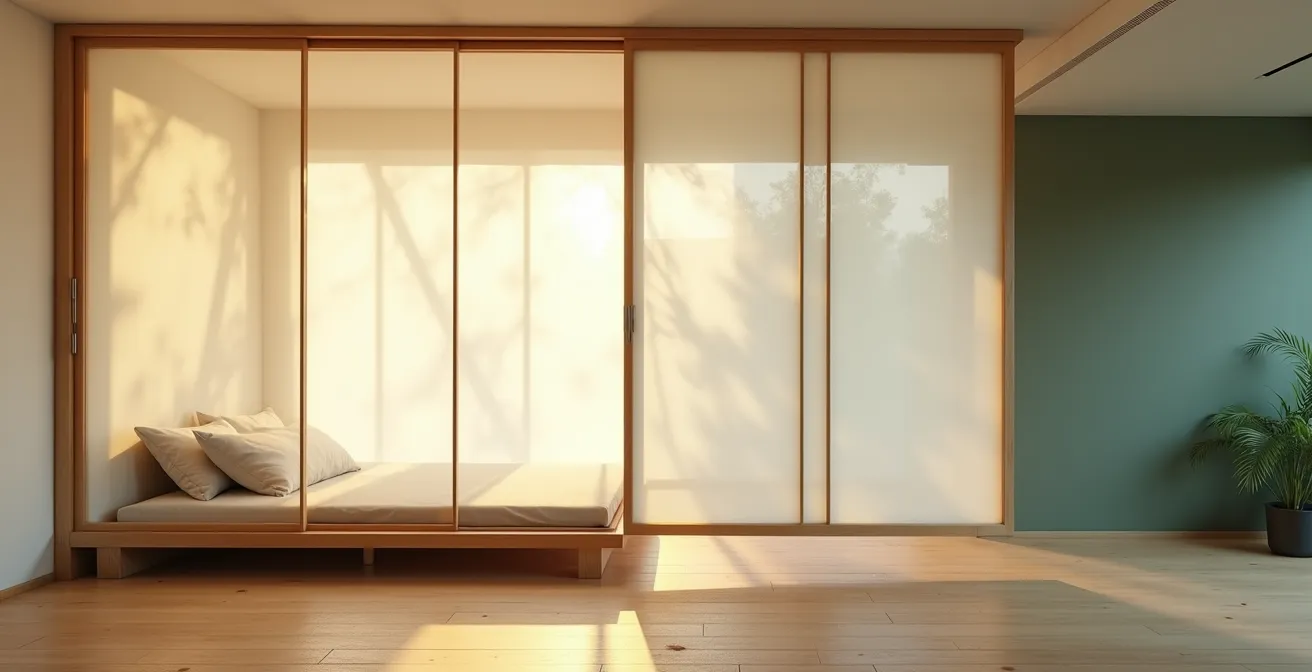
As seen in the image, translucent sliding panels are an elegant solution. They create a clear visual boundary and offer privacy when needed, but they allow a soft, diffused glow to permeate the entire space. This technique creates distinct “light zones” that correspond with functional areas, reinforcing the separation in a subtle, sophisticated way. The key is to think in terms of filtering light, not blocking it. This maintains a connection between the zones while still allowing your bedroom to feel like a sanctuary.
Full-Size vs Apartment-Size Furniture: Which Is Better for Resale Value?
The feelings of claustrophobia and crowding can have negative effects on residents’ well-being, emphasizing the essential role of furniture in these living environments.
– Aisha Saied et al., Impact of Flexible Furniture on Small Spaces Study
The debate between full-size and “apartment-size” furniture is a common dilemma for small space dwellers. The logical choice seems to be smaller pieces to save floor space. However, this decision has a significant psychological impact on both your daily life and the perceived value of your home to a potential buyer. A room filled with undersized furniture can inadvertently signal “compromise” and “temporary,” making the space feel less like a permanent, comfortable home. Conversely, a single, well-chosen, full-size piece, like a deep, comfortable sofa, can anchor the room and create a powerful feeling of luxury and permanence.
This decision is a trade-off between raw space efficiency and psychological comfort. While an apartment-size sofa might free up a few extra square feet, a full-size one can make the entire apartment feel more substantial and “real.” For resale, this can be a major advantage. Buyers often react emotionally to a space, and a layout that feels generous and thoughtfully furnished—even if it’s with fewer, larger pieces—can translate to a higher perceived value. The key is balance: one or two anchor pieces at full scale, with other items being more minimal or multi-functional.
This comparative analysis from a recent study highlights the trade-offs involved in furniture selection for compact living environments.
| Furniture Type | Psychological Impact | Space Efficiency | Resale Perception |
|---|---|---|---|
| Full-Size Sofa | Creates ‘real apartment’ feeling | Takes 20-30% more floor space | Increases perceived value |
| Apartment-Size Pieces | Can signal ‘compromise’ | Maximizes available space | May lower perceived quality |
| Transformable Furniture | Shows innovation | Highest space efficiency | Appeals to urban buyers |
The ‘Push Against the Wall’ Mistake That Kills Intimacy in Small Rooms
There is a pervasive instinct in small-space design: push every piece of furniture flat against the walls. The thinking is that this will maximize the open floor area in the center of the room, making it feel bigger. In reality, this often achieves the opposite. It creates a sterile, lifeless “waiting room” effect where the furniture lines the perimeter and a void sits in the middle. This arrangement kills any sense of intimacy and makes social interaction awkward. Instead of a cozy conversation area, you have chairs and a sofa that are too far apart for comfortable dialogue, often forcing people to shout across the room.
To create a space that feels inviting and encourages connection, you must be brave enough to “float” your furniture. By pulling your sofa and chairs away from the walls and grouping them together, you create a defined, functional zone for conversation and relaxation. This act of grouping is a powerful tool of micro-zoning. It carves out an intentional space within the larger open area. Interior design experts recommend that for comfortable conversation, chairs should be no more than 8 feet apart. Grouping your seating around a central point, like a coffee table or a rug, creates a gravitational pull that draws people in, fostering a much warmer and more intimate atmosphere than a perimeter-based layout ever could.
Even a few inches of space between a sofa and the wall can make a dramatic difference. This small gap creates breathing room, allowing the furniture to exist as a three-dimensional object rather than a flat extension of the wall. It adds a layer of visual depth and sophistication, making the entire arrangement feel more deliberate and professionally designed. The open space in the center of the room might be slightly smaller, but the resulting functional and intimate zone is infinitely more valuable.
How to Exploit Vertical Space to Double Your Storage Capacity?
In a small apartment, the floor is prime real estate, but the most underutilized asset is often the walls. Thinking vertically is not just about adding a few high shelves; it’s a strategic shift to transform your walls from passive surfaces into active, high-capacity storage systems. The goal is to draw the eye upward, which not only provides immense practical storage but also creates an illusion of height and grandeur. A floor-to-ceiling storage unit, for example, becomes an architectural feature in its own right, adding character and a sense of permanence to the space. It replaces the need for multiple smaller, disparate storage pieces that can clutter the floor and the visual field.
Effective vertical storage is integrated and intentional. It’s about more than just stacking boxes. Consider a modular system that can be configured to your exact needs, incorporating a mix of open shelving for display, closed cabinets to hide clutter, and even an integrated fold-down desk. This creates a multi-functional wall that serves several purposes within a single footprint. Another powerful technique is to build storage above sightlines, such as over doorways or high on a wall near the ceiling. When painted the same color as the walls, these storage units blend in, providing “invisible” storage for less-frequently used items without adding visual weight to the room.
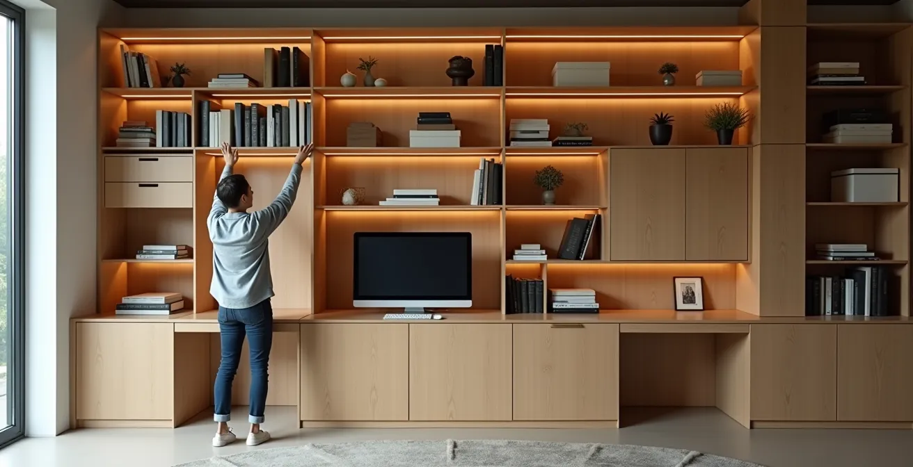
As this example demonstrates, a full-wall system can look elegant and intentional. The combination of open and closed sections prevents it from feeling like a monolithic block, while the human interaction shows its practical scale. Here are some key strategies to implement:
- Install closed cabinetry above doorways and windows, painted to match the walls for a seamless look.
- Create a feature wall with a modular shelving system that incorporates a desk, media center, and storage.
- Use ceiling-height built-ins to maximize every inch of vertical space, creating a custom, high-end feel.
- Implement pull-down storage solutions for easy access to items stored in high zones.
Why Excessive Ornamentation Increases Cognitive Load in Small Homes?
Negative space is as important as furniture placement. Rooms breathe when open areas are preserved for circulation, reflection, and flexibility.
– Aesthetic Home Design Guide, Clear Circulation Paths and Scale Proportional to Space
In a small space, every single object competes for your attention. While decoration adds personality, excessive ornamentation can quickly overwhelm the senses, leading to what psychologists call increased cognitive load. This is the mental effort required to process information. When a room is filled with too much visual stimuli—too many knick-knacks, patterns, and colors—your brain is forced to work overtime just to make sense of the environment. This can lead to a subtle but persistent feeling of stress, restlessness, and the perception that the room is chaotic and smaller than it actually is.
The antidote to this is the strategic use of “negative space”—the empty areas in your room. This isn’t about stark, cold minimalism; it’s about curating your possessions and giving them room to breathe. By leaving some surfaces clear and some walls unadorned, you create moments of visual rest. This deliberate emptiness allows the eye and the mind to relax, which in turn makes the space feel calmer, more organized, and more spacious. The objects you do choose to display become more impactful because they are not lost in a sea of clutter. They are given the spotlight and can be properly appreciated.
Think of it as editing. A great writer knows that the power of a sentence often lies in the words that are left out. Similarly, a great small-space designer knows that the power of a room lies in the objects that are edited out. Before adding a new decorative item, ask yourself: does this serve a purpose or bring me significant joy? Or is it just filling a space? By being highly selective, you reduce visual noise, lower your cognitive load, and create a home that is a true sanctuary, not a source of sensory overload.
How to Turn the Gap Under Your Bed into a Dust-Free Wardrobe?
The space under the bed is one of the most valuable and most frequently wasted storage areas in a small apartment. Too often, it becomes a dusty, chaotic graveyard for forgotten items. The key to transforming this “dead space” into a functional, dust-free wardrobe is to move beyond simple plastic bins and embrace integrated, purpose-built solutions. The goal is to make the storage as accessible and organized as a real closet, turning a hidden gap into a primary storage zone. A platform bed, for example, is a game-changer for small spaces, as it can be designed to incorporate a full system of drawers or cabinets, effectively placing your bed on top of a dresser.
Case Study: The Integrated Platform Bed Solution
In many optimized studio layouts, a custom or off-the-shelf platform bed with built-in storage is the hero piece. Unlike a traditional bed frame with a few rolling bins, this solution eliminates the dusty gap entirely. By featuring full-height cabinet doors along the sides or deep, sealed drawers at the foot, it creates an integrated wardrobe system that maximizes every cubic inch of available space for clothing, shoes, and linens, keeping them organized and dust-free.
Even with a standard bed frame, you can significantly upgrade your under-bed storage. Look for sealed drawer units on castors with integrated lids or brush seals that prevent dust from settling inside. Using vacuum-sealed bags for off-season clothing is another professional trick; this not only protects them from dust and pests but also reduces their volume by up to 75%, allowing you to store far more in the same amount of space. For ultimate organization, consider these steps:
- Install sealed drawer units on castors with integrated lids or brush seals to keep dust out.
- Use vacuum-sealed storage bags for bulky items like duvets and winter coats.
- Build or buy a raised platform bed with full-height cabinet doors on the sides for a seamless look.
- Add battery-powered LED strip lighting inside drawers or cabinets for better visibility.
- Implement a clear labeling system on drawer fronts so you can find what you need without pulling everything out.
Key Takeaways
- Prioritize clear circulation paths; a space you can move through easily feels larger.
- Use furniture and rugs to create “micro-zones” for different activities, giving an open plan structure.
- Balance is key: one or two full-size furniture pieces can make a small apartment feel more substantial and luxurious.
Zoning Strategies: How to Define Spaces in an Open Plan Without Building Walls?
You’ve optimized your circulation flow, chosen your furniture wisely, and decluttered your surfaces. The final masterstroke in designing a small apartment is zoning: the art of creating distinct functional areas in an open-plan space without building a single wall. This is the ultimate application of spatial psychology. By using subtle visual cues, you can tell the brain “this is where we eat,” “this is where we work,” and “this is where we relax,” bringing order and purpose to a single room. Without clear zones, an open-concept apartment can feel confused and chaotic, with activities bleeding into one another.
Rugs are one of the most powerful and simple zoning tools. A rug placed under your sofa and coffee table instantly creates a “living room” zone. Its borders define the space, anchoring the furniture and creating a visual container for the activity. Lighting is another sophisticated technique. You can use a different color temperature of light to define zones: a warmer, softer light (around 2700K) for the cozy living or sleeping area, and a cooler, brighter light (around 4000K) for a functional kitchen or workspace. A pendant light hung low over a dining table also works wonders, creating a distinct “dining room” even if the table is just a small corner of the room.
Ultimately, successful zoning is about layering these different cues. A change in wall color or texture, the placement of a tall plant, or the orientation of a bookshelf can all contribute to delineating space. By combining these strategies, you create a rich, multi-layered environment that feels much larger and more complex than a single open room. You’ve transformed a simple box into a sophisticated system of interconnected spaces, each with its own identity and purpose, providing the full functionality of a larger home within a compact footprint.
Start today by applying these principles. Take a fresh look at your floor plan not as a limitation, but as a puzzle waiting to be solved with creativity and strategic thinking. Re-imagine your space, and you will transform your way of living in it.