In summary:
- Transform a bland, neutral room by focusing on a strategic “textural dialogue” between fabrics, not just adding random pops of color.
- Confidently mix patterns by using a consistent color palette and varying the scale of your prints (e.g., one large floral, one small geometric).
- Invest in quality fabrics like silk or pure linen for key accent pieces; their natural fibers hold dye better and look more luxurious than cheap synthetics.
- Create a “seasonal textile capsule” with 5-7 coordinating pieces to refresh your space for under $100, preventing clutter and waste.
- Proper care is essential. Always wash vibrant textiles in cold water and air-dry them away from sunlight to preserve their color.
Living in a rental often means being surrounded by a sea of neutral colors—the ubiquitous “renter’s beige” or endless shades of grey. While this provides a blank canvas, it can quickly feel sterile, impersonal, and just plain boring. The common advice is to “add a pop of color,” a vague suggestion that often leads to a space filled with random, cheap-looking accents that clash rather than cohere. The result is a room that feels cluttered and disjointed, not curated and stylish.
The real secret to elevating a neutral space isn’t just about adding color; it’s about adding life. This comes from a deliberate and strategic approach to layering. But what if the key wasn’t simply what colors you add, but *how* you introduce them through the textures, patterns, and quality of your textiles? Instead of fighting the neutral backdrop, we can use it as a sophisticated stage to showcase vibrant, thoughtfully chosen fabrics that tell a story.
This guide moves beyond generic tips to offer a stylist’s perspective. We’ll explore why texture is the unsung hero of decor, how to mix patterns like a professional without creating chaos, and how to choose fabrics that look and feel luxurious, even on a tight budget. We’ll cover everything from the science of fabric dyes to the practicalities of seasonal swaps, empowering you to turn your beige box into a vibrant, personalized sanctuary.
In this article, we’ll walk through the essential strategies for using textiles to breathe life into your space. You’ll find a clear roadmap to making smart, stylish, and low-commitment updates that make a huge impact.
Contents: A Renter’s Guide to Vibrant Textiles
- Why Neutral Rooms Feel Flat Without Textural Contrast?
- How to Mix Floral and Geometric Prints Like a Pro?
- Silk vs Cotton: Which Fabric Retains Dye Vibrancy Longer?
- The Laundry Error That Ruins Your Vibrant Cushion Covers
- How to Swap Textiles Seasonally to Change Room Mood Under $100?
- How to Mix a Patterned Rug with Patterned Curtains Without Clashing?
- How to Distinguish Belgian Linen from Cheap Blends instantly?
- How to Choose Patterned Rugs That Won’t Overwhelm a Small Living Room?
Why Neutral Rooms Feel Flat Without Textural Contrast?
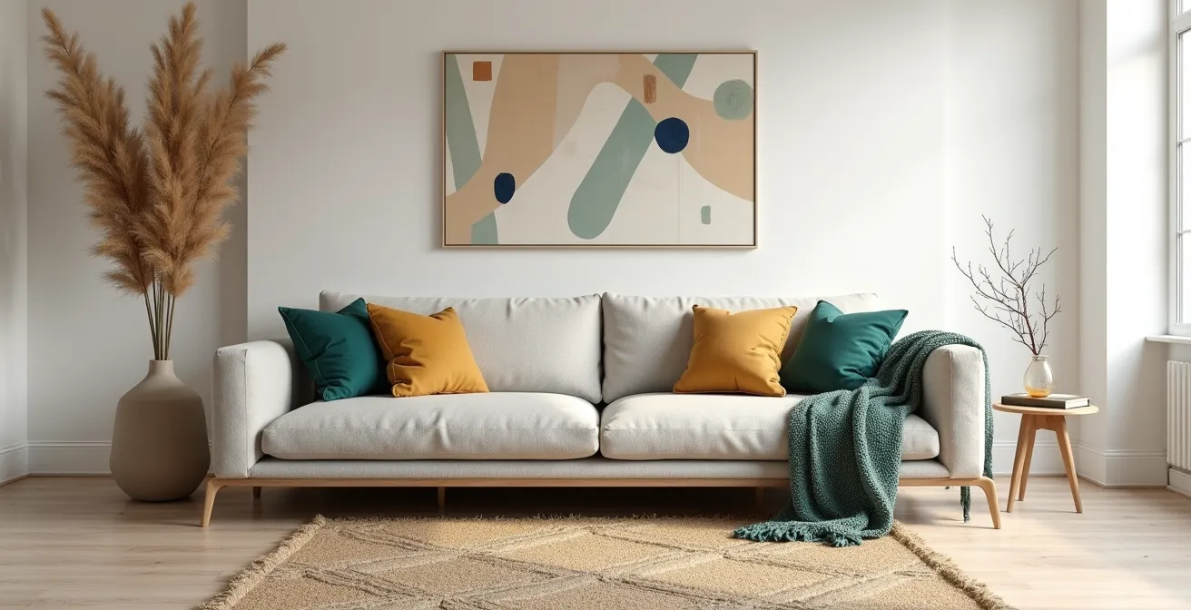
A room painted in neutral tones feels flat for a simple psychological reason: our brains crave sensory input. When everything is visually smooth and uniform, the space lacks depth and interest, feeling sterile and uninviting. The antidote isn’t necessarily a blast of color, but a rich textural dialogue. Texture provides the subtle highs and lows that our eyes can “feel,” creating a sense of warmth and complexity. Studies on biophilic design show that incorporating organic elements helps evoke feelings of tranquility and connection to nature, reducing stress and enhancing well-being.
Think of it this way: a flat, neutral room is like a conversation in a monotone voice. Adding texture is like adding intonation, emotion, and emphasis. A rough, nubby wool throw, a sleek silk cushion, a crisp linen curtain, and a soft velvet pillow all reflect light differently and invite touch. This variety is what brings a neutral base to life.
Start by creating a foundation with your largest neutral piece, like a sofa or rug. Then, layer in a variety of textiles. Don’t be afraid to mix materials that seem opposite. The contrast between a chunky knit blanket and a smooth cotton pillow, or a plush rug against a sheer curtain, is what creates visual excitement. This interplay of textures is the most sophisticated way to build a rich, layered look that feels intentionally designed, not just decorated.
How to Mix Floral and Geometric Prints Like a Pro?
Mixing patterns can feel intimidating, but it’s one of the most effective ways to inject personality into a neutral room. The fear is creating a chaotic mess, but professionals use a few simple rules to ensure harmony. The key is to find a balance between similarity and contrast. The most foolproof method is called “pattern bridging.”
First, choose your “hero” pattern—this will be the largest or boldest print, perhaps a floral cushion. Next, select a secondary, smaller-scale pattern, like a geometric print. The trick is to ensure both patterns share at least one common color. This “bridge” color ties the two designs together, making them feel connected rather than competitive. For example, if your floral pillow has hints of navy blue, choose a geometric-print throw that also features navy blue. This shared hue tells your brain the patterns belong together, even if their styles are different.
Another crucial element is scale. To avoid clashing, vary the size of your patterns. A large-scale floral print pairs beautifully with a small, tight geometric design. The difference in scale allows each pattern to have its own space to breathe. A good rule of thumb is the 80/20 rule: let one pattern dominate (about 80% of the patterned surface) and use the second as an accent (20%). This creates a clear visual hierarchy and prevents the patterns from fighting for attention.
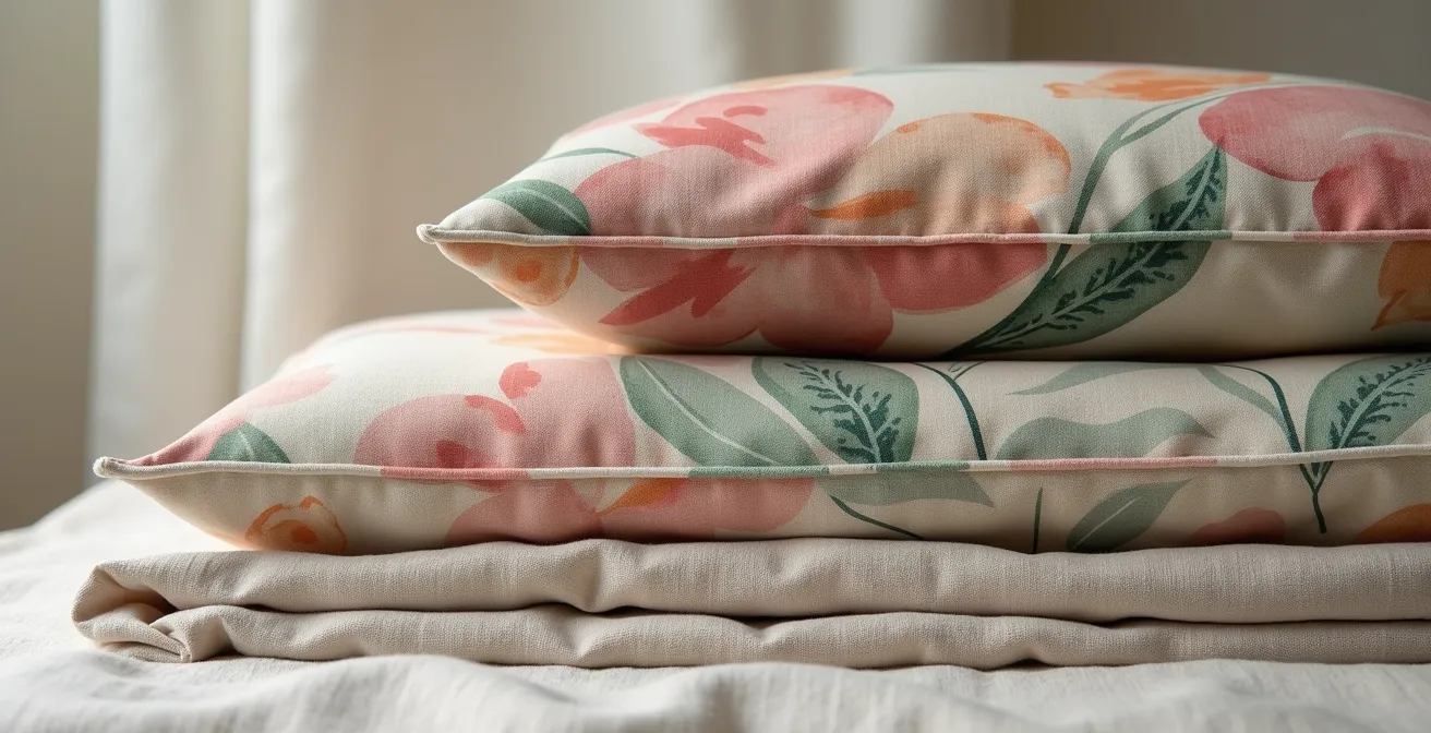
As you can see in this example, the shared dusty rose and green tones create a cohesive look despite the different pattern types. By following these principles of color bridging and scale variation, you can mix prints with confidence, creating a layered, dynamic space that looks expertly styled.
Silk vs Cotton: Which Fabric Retains Dye Vibrancy Longer?
When choosing vibrant textiles, the material itself is just as important as the color. The way a fabric is constructed determines how it accepts and holds dye, which directly impacts its vibrancy and longevity—the very things that separate a “luxe” accent from a “cheap” one. Silk and cotton are two natural-fiber powerhouses, but they behave very differently. An analysis of their dye structures reveals why.
Silk is a protein fiber with a unique, triangular prism-like structure. This shape refracts light like a crystal, giving silk its signature natural luster and shine. This luminosity makes colors appear incredibly deep and rich. Furthermore, silk has a higher natural resistance to UV fading compared to many other natural fibers. This means a vibrant silk cushion will retain its jewel-toned intensity for longer, especially in a sunny room. However, its fine structure requires more delicate care.
Cotton, on the other hand, is a cellulose fiber that is highly absorbent. It soaks up dye beautifully, resulting in rich, saturated colors with a more matte finish. It doesn’t have silk’s natural sheen, but it offers a different kind of depth—a solid, earthy richness. While more susceptible to UV fading over time, high-quality cotton is far more durable and can withstand regular washing, making it a practical choice for high-use items like throws or everyday cushion covers.
For a renter on a budget, this means you can be strategic. Invest in one or two “hero” pieces in silk for that unparalleled color depth and luxurious feel. For items that need to be more durable and washable, opt for high-quality, long-staple cotton.
| Property | Silk | Cotton |
|---|---|---|
| Dye Structure | Triangular protein fibers that refract light | Cellulose fibers with matte absorption |
| UV Resistance | Higher natural UV resistance | More susceptible to UV fading |
| Color Depth | Deep, luminous colors with natural sheen | Rich, saturated matte tones |
| Maintenance | Requires careful handling | More durable for regular washing |
The Laundry Error That Ruins Your Vibrant Cushion Covers
You’ve invested in beautiful, vibrant textiles to bring your neutral room to life. The last thing you want is for them to fade into a dull, disappointing version of their former selves after one wash. The single biggest laundry error is using the wrong temperature and washing them with the wrong items. Hot water is the enemy of vibrant color. It causes fibers to swell and release dye particles, leading to fading and potential bleeding onto other fabrics.
Protecting your investment is simple, but it requires a specific care routine. For any brightly colored or patterned textile, especially cushion covers, you should always default to a cold-water wash. This helps lock the dye into the fibers and preserves the integrity of the print. It’s also crucial to wash them with like colors or, even better, on their own for the first few washes to prevent any rogue dye from ruining other items.
Beyond temperature, a few extra steps can make all the difference in maintaining that just-bought vibrancy. Here are the essential rules for washing your colorful textiles:
- Wash in cold water with fabrics of the same color to prevent bleeding and fading.
- Turn cushion covers and other printed items inside-out before washing to protect the printed or embroidered surface from abrasion.
- For the first one or two washes of a new, deeply colored item, wash it separately and consider using color catcher sheets to absorb any excess dye.
- Air-dry your textiles flat and, most importantly, out of direct sunlight. The sun’s UV rays are a primary cause of fading, and the high heat of a machine dryer can damage delicate fibers and prints.
By treating your vibrant textiles with a little extra care, you ensure they remain a stunning focal point in your room for seasons to come, making your initial investment worthwhile.
How to Swap Textiles Seasonally to Change Room Mood Under $100?
One of the best perks of decorating with textiles is their versatility. For a renter, they offer a low-commitment, high-impact way to completely change the mood of a room without touching a paintbrush. The most strategic and budget-friendly way to do this is by creating a “seasonal textile capsule.” The idea is simple: instead of buying random pieces, you curate a small, coordinated collection for each season that you can swap in and out.
Start by choosing neutral, timeless pieces for your largest investments like your sofa and flooring. This provides the perfect base. Then, build a capsule of 5-7 coordinating textile pieces. This might include a throw blanket, three cushion covers, a small accent rug, and maybe a new set of curtains. For under $100, you can focus on acquiring one “hero” piece in a luxe fabric (like a velvet or silk pillow) and supplement with more affordable but still high-quality cotton or linen items. This strategy prioritizes quality over quantity, which is key to avoiding a cheap look.
Your seasonal capsules can reflect the mood of the time of year:
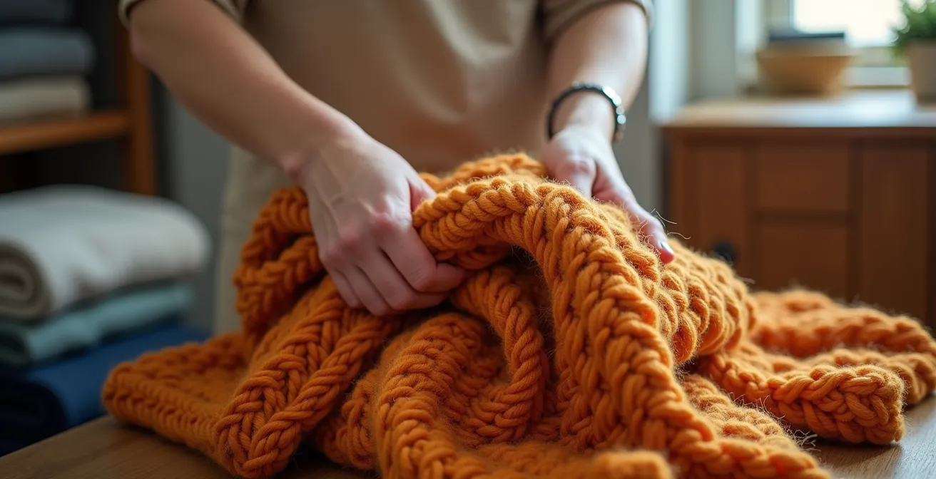
- Autumn/Winter: Think warm, cozy textures. Chunky wool knits, faux fur, velvet, and flannel in deep, rich colors like terracotta, mustard yellow, and forest green.
- Spring/Summer: Opt for light, airy fabrics. Crisp linen, smooth cotton, and sheer silks in bright, fresh colors like coral, sky blue, and leafy greens.
When the season changes, simply pack away one capsule and bring out the next. Storing off-season textiles in vacuum-sealed bags is a great space-saving trick for renters, protecting them from dust and moisture. This rotating system keeps your decor feeling fresh and intentional, allowing you to completely transform your space multiple times a year on a minimal budget.
How to Mix a Patterned Rug with Patterned Curtains Without Clashing?
Pairing a patterned rug with patterned curtains is a bold design move that can look incredibly chic and professionally styled when done right. It’s a fantastic way for renters to make a huge statement without permanent changes. The secret to success lies in creating a clear visual hierarchy and a sense of connection, a principle that a recommended method for establishing harmony relies on heavily. This is where the 80/20 rule of pattern scale is your best friend.
First, designate a “lead” and a “supporting” pattern. One pattern—either on the rug or the curtains—must be the dominant, large-scale star of the show. The other must be a smaller, more subtle supporting actor. For example, pair a rug with a large, sweeping floral or geometric design with curtains that have a small, repetitive dot or stripe pattern. This contrast in scale is essential; it prevents the two patterns from competing and creating visual noise.
The second rule is to maintain a consistent color story. Just as with mixing smaller patterns, your rug and curtains must share at least one or two common colors to feel connected. You can pull a less dominant color from your large-scale rug pattern and make it the main color in your smaller-scale curtain pattern. This creates a sophisticated, intentional link between the two. Recent data shows a rise in daring combinations, as 17% of interior designers reported organic and bold patterns as top choices for 2024, so feel empowered to be adventurous.
Finally, give the eye a place to rest. Ensure your other large surfaces, like your sofa and walls, are solid, neutral colors. This negative space provides a visual break, allowing your bold rug and curtain combination to shine without overwhelming the room.
How to Distinguish Belgian Linen from Cheap Blends instantly?
Linen is a fantastic choice for adding texture and a touch of understated luxury to a neutral room. However, the market is flooded with cheap polyester blends masquerading as the real thing. True linen has a unique “fabric integrity” that cheap blends can’t replicate, and as a stylist, knowing how to spot the difference is key to making smart investments. Authentic linen wrinkles beautifully, feels crisp yet soft, and gets better with age. A cheap blend often feels slippery, holds static, and pills over time.
You don’t need a lab to identify authentic linen. There are several quick, physical tests you can perform right in the store to check the quality of a textile before you buy it. These simple checks will help you train your eye and hand to recognize the distinct properties of 100% linen, ensuring you’re getting the quality you’re paying for.
By familiarizing yourself with these characteristics, you can confidently invest in linen pieces that will add genuine quality and timeless style to your home, elevating your decor far beyond what a cheap synthetic could ever achieve.
Your Action Plan: The 5-Step Linen Authenticity Test
- The Crush Test: Grab a corner of the fabric and crush it tightly in your hand for a few seconds. Real linen will wrinkle sharply and hold the creases. Polyester blends will either resist wrinkling or form soft, blurry creases.
- The Light Test: Hold the fabric up to a light source. True linen is made from flax fibers, which are naturally irregular. You should see small variations in thread thickness (known as “slubs”). A perfectly uniform, machine-made look is a red flag for a synthetic blend.
- The Water Droplet Test: If you can, place a single drop of water on the fabric. 100% linen is highly absorbent and will soak up the water almost instantly. A synthetic or treated blend will cause the water to bead up on the surface.
- The Touch Test: Authentic linen has a distinct feel—it’s crisp and cool to the touch, but also has an underlying softness. It shouldn’t feel slippery or overly smooth, which are common characteristics of polyester. With use, it becomes much softer.
- The Burn Test (For Swatches Only): If you have a fabric swatch, you can perform a burn test. A tiny piece of pure linen will burn quickly, smell like burning paper, and leave a fine ash. Synthetics will melt into a hard, plastic-like bead and emit a chemical smell.
Key Takeaways
- The secret to a vibrant neutral room is layering texture, not just adding color. Mix materials like wool, silk, and linen.
- Confidently mix patterns by varying their scale (one large, one small) and connecting them with a shared “bridge” color.
- Invest in fabric quality. Natural fibers like silk and pure linen hold dye better and provide a luxurious look that cheap synthetics cannot replicate.
How to Choose Patterned Rugs That Won’t Overwhelm a Small Living Room?
A patterned rug can be the single most transformative element in a small living room, acting as art for your floor. However, renters often shy away from them, fearing they will make their already small space feel cluttered and chaotic. The key is not to avoid pattern, but to choose the *right* pattern. The goal is to create interest and define the space without visually shrinking it.
The most important factor is the relationship between pattern scale and contrast. A common mistake is choosing a small, busy, high-contrast pattern. This creates a lot of visual noise and can make the floor feel like it’s crawling towards you, making the room feel smaller. Conversely, a large-scale, low-contrast pattern can actually make a room feel bigger. The large motifs create a sense of flow and expansiveness, while the low contrast (e.g., cream on beige, or light grey on off-white) provides texture and interest without being jarring.
Tone-on-tone patterns are another excellent choice for small spaces. They offer the richness of a pattern but in a very subtle, sophisticated way. The texture adds depth and a cozy feel without demanding attention. When choosing a rug, it’s also important to ground it. Ensure there is a neutral “rest zone” around it, with solid-colored furniture and walls. This allows the rug to be the star without overwhelming the senses.
This table breaks down how different pattern types impact the perception of space, helping you make a confident choice.
| Pattern Type | Visual Impact | Best For Small Rooms |
|---|---|---|
| Large-scale, low-contrast | Creates flow, less overwhelming | Yes – adds interest without chaos |
| Small-scale, high-contrast | Creates visual noise, busy feeling | No – can make space feel cluttered |
| Tone-on-tone patterns | Subtle texture, calming effect | Yes – adds depth without overwhelm |
| Geometric patterns | Can expand or contract space visually | Depends on scale and contrast |
Now that you’re armed with the stylist’s secrets to texture, pattern, and quality, you can move beyond the ‘beige box’ and start curating a space that truly reflects your personality. Begin by assessing your room and choosing one area to transform—perhaps with a few new cushions or a statement throw—and build from there.