In summary:
- Creating a curated look is not about buying more things, but understanding the principles of visual storytelling and balance.
- Fundamental rules like the “Rule of Three” and “60-30-10” are starting points, not rigid laws. Their power lies in understanding the psychology behind them.
- Mastering details like color undertones, rug placement, and the use of light is what separates a pleasant room from a professionally styled space.
- A successful decor scheme feels personal and cohesive, telling a story through intentional arrangement rather than random clutter.
You have the beautiful objects, the cherished books, and the art you love. Yet, when you arrange them on your shelves or coffee table, the result feels less like a magazine spread and more like… clutter. It’s a common frustration for DIY decorators: the gap between having good taste and creating a space that truly reflects it. Many believe the solution lies in a strict set of decorating rules or hiring an expensive stylist, leading them down a rabbit hole of generic advice that never quite clicks.
The internet is filled with platitudes: “de-clutter,” “vary object height,” and “add a pop of color.” While not incorrect, this advice scratches only the surface. It tells you the “what” but completely ignores the “why.” But what if the secret to a curated home wasn’t about memorizing rules, but about understanding the core visual principles that make them work? What if you could learn to think like a stylist, developing an instinct for balance, tension, and narrative?
This is the shift we’re going to make. This guide moves beyond the basics to reveal the thinking behind professional styling. We will deconstruct the most common decorating challenges, from cluttered shelves to disjointed color schemes, and transform them into opportunities for intentional design. You will learn not just the rules, but how to apply them with confidence—and, more importantly, when and how to break them.
For a dose of visual inspiration, the following video takes you on a unique home decor shopping trip, showcasing the kind of curated pieces that can bring a personal story to your space.
This article is structured to build your styling skills from the ground up. We’ll tackle specific areas and concepts one by one, giving you the practical knowledge and confidence to transform your space. Explore the sections below to start your journey from DIY decorator to home-styling master.
Summary: How to Master Curated Decor and Style Your Home Like a Professional
- Why Your Shelves Look Cluttered Instead of Curated?
- How to Apply the Rule of Three for Instant Visual Harmony on Coffee Tables?
- Statement Art or Gallery Wall: What Works Best for a 12ft Wall?
- The Color Matching Error That Disjoints Your Entire Decor Scheme
- When to Rotate Your Decor: A Seasonal Guide for Fresh Interiors
- The ‘Floating Rug’ Mistake That Disconnects Your Seating Area
- Where to Place Metallic Accents to Catch the Golden Hour Sun?
- Where to Hang Wall Mirrors to Double the Natural Light in North-Facing Rooms?
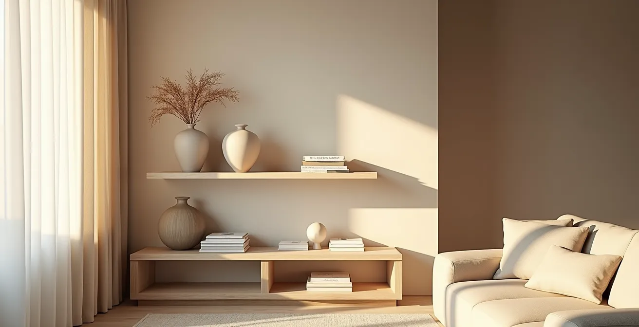
Why Your Shelves Look Cluttered Instead of Curated?
The line between a vibrant, personal collection and simple clutter is frustratingly thin. You see “shelfies” online that are rich with personality, yet your own attempts feel chaotic. The problem often isn’t what you own, but a lack of a cohesive story. Clutter is a collection of disconnected items; curation is a collection of items that speak to each other, creating a single, harmonious narrative thread. This is a common struggle, so much so that professional help is often sought; an industry report shows that nearly 55% of interior designers are employed by firms, frequently tasked with solving this exact issue.
The “bookshelf wealth” trend highlights this perfectly. It’s not about having perfectly aligned, unread books. Instead, it’s about curating a “whole home vibe” that feels warm, personal, and lived-in. This look is achieved by layering books with mismatched art, cozy textures, and personal objects that tell the story of the owner. The goal is to reduce visual noise, not personality. Start by clearing your shelves completely. This blank canvas forces you to be intentional about every single item you put back. Ask yourself: does this object contribute to the story I want to tell?
Think about varying not just height and size, but visual weight. A small, dark, and complex object can have the same visual weight as a larger, light-colored, simple one. Mix them. Place a large piece of art as an anchor and then layer smaller items, like pottery on a stack of books, in front of it. Give your items breathing room—negative space is a luxury that signals confidence and prevents a display from feeling suffocating. If you’ve tried multiple arrangements and it still feels messy, the answer is simple: you have too many items. Edit ruthlessly.
Curation is an active, not a passive, process. It’s about making deliberate choices to create a mood and a story, turning a simple shelf into a personal gallery.
How to Apply the Rule of Three for Instant Visual Harmony on Coffee Tables?
The “Rule of Three” is one of the most repeated phrases in decorating, but it’s often treated like a magic formula without explanation. The principle states that arranging items in groups of three (or any odd number) is more visually appealing and memorable than even-numbered groupings. This isn’t just designer dogma; it’s rooted in psychology. Our brains are wired to find patterns, and a group of three creates a sense of intentional asymmetry. It forces our eyes to move around the composition, making it more dynamic and engaging. With two items, the eye sees a pair; with four, it sees two pairs. Three items create a defined shape and a clear focal point.
This is because research consistently demonstrates that our brains find odd-numbered groupings, especially sets of three, more engaging and aesthetically pleasing. To apply this effectively on a coffee table, think in terms of a triangle. Your three items should have varying heights and scales to form the points of this invisible triangle. For example: a tall vase (high point), a stack of books (medium point), and a small decorative bowl (low point). This variation creates a pleasing visual rhythm and prevents the arrangement from looking flat and static.
This image perfectly demonstrates a balanced trio of objects, varying in height, shape, and texture to create a dynamic yet harmonious coffee table vignette.
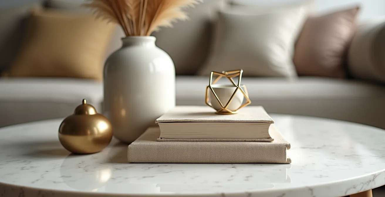
As you can see, the composition feels complete and intentional. To take this a step further, you can use a simple framework that categorizes the types of objects to use in your trio. This ensures you have a good mix of function, form, and texture.
The following table breaks down three common archetypes for coffee table styling. Using one item from each category is a foolproof way to build a successful arrangement.
| Element Type | Function | Example Items |
|---|---|---|
| Boxes (The Anchor) | Heavy, grounding base element | Decorative boxes, stacked books, trays |
| Bowls (The Star) | Personal or sculptural centerpiece | Ceramic bowls, sculptural objects, vases |
| Brass (The Connector) | Smaller textural linking element | Metallic accents, candles, small frames |
Ultimately, this rule provides a simple roadmap to a sophisticated result, turning a blank surface into a curated focal point.
Statement Art or Gallery Wall: What Works Best for a 12ft Wall?
As celebrated designer Shea McGee advises, the goal is to “Bring your walls to life like a designer—balancing scale, height, and style.” A large, empty wall—like a 12-foot expanse—is an opportunity, not a problem. The two primary solutions are a single piece of statement art or a multi-piece gallery wall. The right choice depends entirely on the atmosphere you want to create and the existing furniture layout. Neither is inherently better, but they serve different visual purposes.
A large piece of statement art acts as a commanding focal point. It’s confident, definitive, and simplifies the room’s visual landscape. For a 12-foot wall, “large” means at least 48-60 inches wide. It’s the perfect solution for minimalist or modern spaces where you want to create a singular, powerful impact. It anchors the space, drawing the eye immediately and setting the tone for the entire room. If your room already has multiple patterns or a lot of decorative objects, a single piece of art can provide a much-needed moment of visual rest.
A gallery wall, by contrast, is dynamic, personal, and tells a more complex story. It’s a collection of smaller pieces that work together as a whole. This is an excellent choice for eclectic, traditional, or family-oriented spaces. A successful gallery wall requires a unifying element. Don’t just hang random frames. To create cohesion, you can use:
- A consistent color story across the artworks.
- A personal timeline theme (e.g., travel photos, family portraits).
- A consistent frame color or matting style, even if the art styles vary.
- A thematic collection, such as botanical prints or abstract sketches.
For a large 12-foot wall, you shouldn’t treat it as a single canvas. Instead, treat it as multiple zones. Anchor the main seating area with a large, grouped cluster of artwork, but leave some negative space on other parts of the wall to allow the arrangement to breathe. The balance between the art and the empty space is just as important as the art itself.
Whether you choose a bold statement or a personal gallery, the key is intentionality. Both approaches can anchor a room beautifully when executed with a clear vision of balance and scale.
The Color Matching Error That Disjoints Your Entire Decor Scheme
You’ve picked a beautiful paint color, a lovely sofa, and stylish curtains, but something feels off. The room looks disjointed, not cohesive. This is often due to a subtle but critical error: clashing undertones. While many DIY decorators are familiar with the 60-30-10 rule for color distribution, they often overlook the color temperature—the warm (yellow, beige, red-based) or cool (blue, gray, green-based) undertones of their “neutrals.” Mixing a cool gray wall with a warm beige sofa can create an unconscious visual tension that makes a room feel unsettled.
The 60-30-10 rule is a fantastic starting point. As a guideline, professional interior designers use the 60-30-10 Rule, dedicating 60% of the room to a dominant color (walls), 30% to a secondary color (upholstery, curtains), and 10% to an accent color (pillows, art). But its success hinges on all three colors sharing a compatible undertone. To identify an undertone, compare your neutral swatch to a pure white. A creamy, ivory-leaning color has warm undertones. A crisp, blueish-leaning color has cool undertones.
The visual below illustrates the difference between warm and cool undertones across various materials, showing how they create distinct feelings.

Notice how the warm tones on the left feel cozy and inviting, while the cool tones on the right feel crisp and serene. The Studio McGee style, for instance, heavily favors a light, earthy palette of browns, blues, and greens with cool or neutral undertones to create an open, airy feel. They then add a pop of black or dark green for contrast, which works because black is a neutral that can bridge warm and cool tones. The key is to decide on a dominant temperature—warm or cool—and ensure all your major pieces adhere to it.
This doesn’t mean your entire room must be beige or gray. You can have a blue sofa in a room with warm tones, as long as it’s a warm blue (like a teal or navy with a hint of green) rather than a cool blue (like a cobalt or sky blue). The most common mistake is pairing a cool gray wall paint with warm wood floors or furniture (like oak or cherry) without a bridge. In this case, your 10% accent color becomes critical—a rug or artwork containing both the cool gray and the warm wood tone can tie the entire scheme together.
Before your next paint or furniture purchase, hold the samples together in natural light. Your eyes will tell you if they’re fighting or harmonizing. Getting the undertones right is the invisible work that makes a room feel effortlessly chic.
When to Rotate Your Decor: A Seasonal Guide for Fresh Interiors
A truly curated home is not a static museum; it’s a living space that evolves with the seasons and your life. The idea of rotating decor can seem daunting, conjuring images of hauling boxes from storage four times a year. However, the professional approach is much simpler and more impactful: the micro-rotation. This strategy is about making small, high-impact changes that keep your space feeling fresh and current without a complete overhaul. It’s less about a seasonal theme (like pumpkins in fall) and more about shifting the mood with texture, color, and natural elements.
The core principle is to establish a strong, season-neutral foundation. About 80% of your decor—major furniture, rugs, and key art—should be timeless. The remaining 20% are your “rotators.” These are the easy-to-swap items: throw pillows, blankets, coffee table books, vase fillers, and small art pieces. This approach not only makes seasonal updates manageable but also aligns with a more sustainable mindset. The trend towards using sustainable and natural materials is a movement, and incorporating elements like wooden trays, ceramic vases, or foraged branches connects your home to the world outside.
In spring, you might swap a heavy wool throw for a light linen one and fill a vase with fresh tulips. In winter, you could change the art on an easel to a moodier landscape and replace a ceramic bowl with a warm brass one. These are tiny shifts, but they have an outsized impact on the room’s atmosphere. One of the easiest and most effective strategies is the “one-in, one-out” rule: each week, simply change one thing. Swap the book on your nightstand or the candle on your mantel. This constant, gentle editing keeps you engaged with your space and prevents it from becoming stale.
Your Action Plan: The Micro-Rotation Strategy
- Define Your Core: Take inventory and identify the 80% of your decor that is season-neutral. These are your foundational pieces that will remain in place year-round.
- Curate Your Rotators: Select the 20% of your items that are easy to swap. This includes textiles (pillows, throws), small objects, books, and art.
- Implement the “One-In, One-Out” Rule: On a weekly or bi-weekly basis, make one small change. Swap the art on an easel, change the top book on a coffee table stack, or switch out a decorative object.
- Forage for Freshness: Use nature as your free decor shop. A few tree clippings, branches, or seasonal flowers in an oversized vase can instantly update the feel of a room.
- Store and Stage: Create an accessible, organized storage spot for your off-season “rotator” items. Having them ready to go makes the next swap effortless and enjoyable.
By adopting this mindset, you’re not just decorating; you’re actively curating the experience of living in your home, ensuring it always feels like a true reflection of the present moment.
The ‘Floating Rug’ Mistake That Disconnects Your Seating Area
A rug is one of the most powerful tools for defining a space, yet it’s also one of the most common sources of decorating mistakes. The single most frequent error is the “floating rug”: a rug that is too small for the furniture group and sits isolated in the middle of the floor, touching nothing. This visually disconnects the furniture, making the pieces look like they are drifting apart and causing the entire room to feel smaller and less cohesive. A rug’s primary job in a living area is to unify the furniture, creating a “psychological island” that defines the conversation zone.
The definitive rule, championed by designers like Shea McGee, is the “front-two-legs” rule. To properly ground a seating area, the rug must be large enough for at least the front two legs of your sofa and any accent chairs to rest comfortably on it. This simple act visually tethers the pieces together, creating a unified whole. When all your seating is connected by the rug, the area feels intentional, anchored, and inviting. If you’re debating between two rug sizes, always choose the larger one. A too-small rug will always look like a mistake, while a generously sized one signals luxury and thoughtful design.
This same principle can be used to your advantage in open-plan spaces. You can use separate, smaller rugs to create distinct functional zones—one for the seating area, another for the dining area. This creates visual separation and order without building walls. Rugs can also manipulate the perception of a room’s proportions. To make a long, narrow room feel wider, orient the rug so its longest side runs perpendicular to the room’s length. The horizontal lines of the rug will visually push the walls apart, correcting the “bowling alley” effect.
Think of your rug not as a floor covering, but as the foundation of a room’s layout. By ensuring it connects rather than floats, you create a space that is not only more beautiful but also more functional and psychologically comfortable.
Where to Place Metallic Accents to Catch the Golden Hour Sun?
Metallic accents are the jewelry of a room. They add a touch of glamour, reflect light, and provide a necessary textural contrast to softer materials like wood and fabric. But to truly elevate their impact from mere decoration to a design moment, you must place them with intention. The ultimate pro move is to position them to interact with natural light, especially the warm, low-angled light of the “golden hour” just after sunrise and before sunset. This creates a dynamic space where, for a few moments each day, specific objects come alive with a magical glow.
This requires becoming a student of the light in your own home. Use the Path of Light Tracking Method: over the course of a day, observe where the sunbeams fall in your room during those golden hours. Mark these spots, either mentally or with a piece of tape. These are your prime locations for metallic accents. A brass vase on a windowsill, a polished nickel tray on a side table in the light’s path, or a mirror with a metallic frame on a wall hit by the setting sun will create a deliberate, dazzling effect that feels both natural and thoughtfully designed.
Don’t be afraid to mix metals, as this adds depth and sophistication. A good rule of thumb is 70% dominant metal (like matte black fixtures) and 30% accent metal (like brushed brass or polished nickel). The finish is as important as the color. A polished, shiny finish creates a sharp “gleam” that adds energy and is perfect for high-traffic spaces. A brushed or satin finish produces a soft “glow” that feels more relaxed and is ideal for bedrooms or cozy reading nooks. This trend is gaining traction, especially in popular styles like mid-century modern, with metallic accents and Murano glass pendants gaining popularity as key features.
By strategically placing your metallic pieces, you’re not just adding shine; you’re choreographing a daily light show that brings your space to life in a truly special way.
Key takeaways
- Curation is about creating a narrative with your objects, not just achieving tidiness.
- Decorating rules like the ‘Rule of Three’ work because they create intentional asymmetry that is more engaging to the human eye.
- Matching the undertones (warm vs. cool) of your colors is more critical for a cohesive look than the 60-30-10 ratio itself.
- A successful layout uses rugs to create “psychological islands,” connecting furniture to ground the space.
Where to Hang Wall Mirrors to Double the Natural Light in North-Facing Rooms?
North-facing rooms present a unique challenge: they receive consistent, indirect light throughout the day, but it can often feel flat, cool, and a bit dim. The single most effective tool to combat this is a well-placed mirror. A foundational interior design principle states: “A mirror doubles whatever it reflects—it should always reflect a view, a source of beauty, or a source of light.” In a north-facing room, its primary job is the latter. The mistake is hanging a mirror on the same wall as the window; instead, you must place it on the wall opposite or adjacent to the window. This placement will capture the incoming light and bounce it back into the room, effectively doubling its brightness and reach.
Think of the mirror as a second window. By positioning it strategically, you are not only amplifying light but also creating the illusion of more space and depth. For maximum effect, go as large as your wall and budget will allow. A large, floor-length mirror leaning against the wall opposite a window can dramatically transform a dim corner into a bright, airy space. It tricks the eye into perceiving a much larger, brighter room.
You can also use the “Phantom Window Technique.” This is especially effective in rooms with few or no windows. By using a large, arch-top mirror or by arranging a grid of smaller square mirrors, you can create the illusion of a window frame. This adds architectural interest while performing the crucial function of light reflection. When employing this technique, balance is key. If the lower part of your room is visually heavy with furniture, keep the upper areas more open to enhance the sense of space and light that your “phantom window” creates.
The goal is to be strategic. Before you hang a mirror, hold it up in the proposed location and see what it reflects from the main vantage points of the room (like the doorway or the sofa). Is it reflecting a beautiful view, a piece of art, or a bright window? If it’s reflecting a blank wall or a cluttered corner, find a better spot. The mirror will amplify whatever is in front of it—make sure it’s something worth seeing twice.
Now you have the principles to move beyond simply filling space and start truly styling it. Begin today by choosing one small area—a single shelf or your coffee table—and apply one of these concepts. This is how you build the confidence to stop decorating by accident and start curating your home with intention.